24th Jul 2012 Apple’s History of Skeuomorphism
A lot of people have been displeased by the skeuomorphic design elements appearing in Apple’s latest operating systems. Some attribute these design decisions to the tastes of Steve Jobs. I don’t think anyone could clearly define the tastes of Steve Jobs, not even himself. One minute he might be appreciating the craftsmanship of his Bsendorfer grand piano, the next he might be observing the minimalistic teachings of Zen sitting cross legged on the floor of his unfurnished home. If there is one thing that could be said for Steve Job’s taste it is that he only wanted the best. Apple’s history with skeuomorphism reflects the desire to present users with the best technology has to offer, even if that desire is misguided, and Steve is not around.
The Desktop Metaphor
Steve Jobs might not have started the desktop metaphor, but he did bring it the world’s eye with the introduction of the Macintosh. Before the Mac there was no skeuomorphism, because there was no graphical user interface. For almost thirty years the iconography of desktop objects have greeted users as they stare into their computer screens. The desktop metaphor has given new computer users a familiar foundation to ground their experiences upon, and expert users terminology such as “files” and “folders” we still use today.
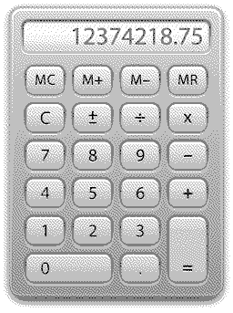
The Classic Calculator
Steve Jobs was so concerned with the skeuomorphic design details of the Classic Mac OS Calculator that early Apple employee Chris Espinosa had to develop “the Steve Jobs Roll Your Own Calculator Construction Set” just so that he could get it right.
Every decision regarding graphical attributes of the calculator were parameterized by pull-down menus. You could select line thicknesses, button sizes, background patterns, etc.
Steve took a look at the new program, and immediately started fiddling with the parameters. After trying out alternatives for ten minutes or so, he settled on something that he liked.
The calculator Steve designed remained the standard calculator on the Macintosh for over sixteen years, all the way up through Mac OS 9.
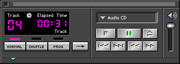
Apple CD Audio Player
By the time System 7 shipped in 1991, Steve Jobs had long since left Apple, but his appreciation for the finer things in life was still ingrained in the minds of software engineers working on the Mac. One of their creations, the Apple CD Audio Player, brought an unconventional skeuomorphic design to the Mac that allowed users to adjust the color of the apps stereo receiver facade. This was a first for Mac software, and an unusual move for Apple who normally prohibited users from changing the appearance of the Mac OS. The trend of user customizable themes, and skeuomorphic app designs would continue with the release of Mac OS 8.
Mac OS 8
The introduction of Mac OS 8 on July 26, 1997, brought with it the Appearance Manager, and a new face to the Macintosh GUI called Platinum. The Appearance Manager was originally developed for Apple’s failed en.wikipedia.orgwikiCopland_(operating_system text: Copland) project. It introduced a layer of abstraction between the Control Manager and QuickDraw allowing users to theme the Mac OS. Platinum, the default theme, introduced 3D elements into the Mac OS GUI through the use of subtle shadows and simple gradients. Platinum wasn’t the only Apple-developed theme though.
Hi-Tech is based on a shades-of-black color scheme that made the interface look like a piece of stereo equipment. Gizmo is a “kids” interface, using lots of bright colors and “wiggly” interface elements. Both changed every single element of the overall GUI leaving no trace of Apple Platinum. A third theme was later introduced, Drawing Board, developed at Apple Japan. This theme uses elements that make the interface look like it has been drawn in pencil on a drafting-board, including small “pencil marks” around the windows, a barely visible grid on the desktop, and “squarish” elements with low contrast. Although none of these themes were included with a released version of Mac OS, the files can be copied from the pre-release versions that contained them and successfully used on retail versions.
The optional themes in Mac OS 8 might have been Apple’s greatest example of skeuomorphism to date, but it was Steve Jobs who decided to officially drop support for themes in order to preserve a consistent user interface. Themeing would live on in later versions of the Classic Mac OS and even into the early days of Mac OS X, but only as eggfreckles.net(kaleidoscope.netWhat_is_Kaleidoscope.html text: third-party extensions) and haxies.
QuickTime 4
Intended to showcase the technological improvements of the QuickTime 4.0 multimedia technology, the QuickTime 4.0 Player sported a completely re-imagined user interface designed to look like a “real-world” consumer electronics device. The QuickTime 4.0 interface represented an almost violent departure from the long established standards that had been the hallmark of Apple software by introducing skeuomorphic design elements such as drawers, brushed metal, dials, and borderless windows that would haunt the Macintosh GUI for years to come.
We find this trend toward “consumer” interfaces to be particularly disturbing. The design places a premium on aesthetics over usability. The emphasis is on creating a flashy product, and not on creating a useful and usable product. Rather than asking, “How can we make this look more like a real thing?”, the designers would do their users a far more important service by asking, “How can we make this operate better than the real thing”. To use the QuickTime 4.0 Player as an example, the designers spent far too much time making the software look like a hand-held player, and far too little time examining how they might add utility to such a player. A hand-held player is just that: a player. A software-based multimedia viewer can become an information device. It would appear that this latter approach was never considered in the design of QuickTime.
Apple DVD Player
The Apple DVD Player that shipped with Mac OS 9 went far beyond apps without windows. It shipped with a completely round user interface that more closely resembled the Puck Mouse from the first iMac than a traditional Mac OS application. It is hard to grasp the design decisions made around the Apple DVD Player, and even harder to grasp the app itself. Without a titlebar, or window border to speak of the Apple DVD Player was a skeuomorphic flop that kept users guessing how to drag it off screen long after the movie had started to play. In the age of the candy colored iMacs, and the dawn of brushed metal, Apple emphasized form over function to keep things cool and tide customers over until the arrival of Mac OS X.
iTunes
Another Skeuomorphic design that kept things cool before the arrival of Mac OS X’s Aqua interface was the deeply beveled, brushed metal interface of iTunes 1.0. Complete with jelly bean volume sliders, and Aqua blue accents, iTunes 1.0 looked like something straight out of the future, even running under Mac OS 9. The Faux LCD interface is still a part of iTunes today, but back in version 1.0 the screen was purposely left pixelated to preserve the look of a high-end stereo receiver. (Bitmapped greyscale displays were still a luxury feature on the stereos of 2001.) As an experiment the iTunes user interface was a complete success. Just the right mixture of skeuomorphic cool, combined with the usability of a conventional GUI. iTunes showed the world that skeuomorphic accents could work as long as user interface fundamentals were preserved.
Aqua
Aqua, the Mac OS X user interface, brought many of the accents that made Apple hardware cool and fun to use back to the Mac OS. There were jelly bean buttons, like the CD eject button on the very first iMac. There were translucent colors, like the blue apple on the Power Mac G3, G4, and G4 Cube, There were pinstripes, like those found on all of Apple’s Studio Displays and iMacs shipping at the time. For the first time in history, computer graphics were powerful enough to support photorealistic icons, smooth animations, high-definition textures, and deep drop shadows. Apple didn’t hesitate incorporating these features into Mac OS X, and in doing so changed what we thought of computer interfaces forever. Everything else looked dated in comparison.
As time progressed, the Aqua interface has evolved to reflect the changes in Apple hardware. Gone are the over the top transparencies, deep drop shadows, and distracting pinstripes. Subtle grays, mute reflections, and soft gradients now fill the retina displays of Apple’s latest portables. Some might say that Aqua is not a skeuomorphic interface because it does not resemble a specific real world object. To them I say Aqua is a mirror reflecting back the design decisions that have made Apple’s hardware so appealing over the last 10 years.
Brushed Metal
Despite the abundance of candy colored hues, silky blues, and soft gradients, Mac OS X imprisoned many of its apps in a colder metallic texture for several years. Born in the dark ages of QuickTime, Sherlock, and iTunes, Brushed Metal made its way into the world’s most advanced operating system as an optional interface theme. Apple’s Human Interface Guidelines state that the brushed metal interface should be used for programs that mimic the operation of, or interface with, common devices, but that didn’t stop Apple from bringing Brushed Metal to the Finder and Safari in Mac OS X 10.3 Panther. Out of all of Apple’s skeuomorphic faults, brushed metal might be the most loathed by long time Mac users. It was retired from Apple’s desktop operating system in October 2007 with the release of Mac OS X 10.5 Leopard.
iOS & Back to the Mac
The runaway success of the iPhone, iPad, and iPod Touch have introduced a whole new generation of users, both young and old, to modern computing. To help them find their way, Apple has littered their path with real-world objects such as torn paper, Corinthian leather, wooden bookshelves, green tabletop felt, stitched pages, dark linen, reel-to-reel tapedecks, and highway road signs. Apologists for skeuomorphic design maintain that users will more readily be able to transfer their knowledge of real-world objects to software using these helpful guides. Unfortunately, the apologists fail to recognize that there are two likely consequences of this approach:
- The user is unable to transfer his or her existing knowledge of computer interaction.
- The software becomes needlessly subject to the limitations of the physical device.
With the release of Mountain Lion, Apple is bringing even more “helpful guides” back to the Mac, and needlessly limiting the capabilities of software. With the dawn of the Retina display, and more pixels to fill, I don’t think the trend of skeuomorphic design is going to stop anytime soon, even after the passing of Steve Jobs.